

12 Romantic Fall Wedding Color Palettes to Inspire Your "I Do"
- Joao Nsita
- Jul 29, 2025
- 16 min read


There is an undeniable magic to a fall wedding. The air turns crisp, the light softens to a golden hue, and nature itself provides the most breathtaking backdrop of amber, crimson, and gold. This season of cozy sweaters and pumpkin-spiced everything offers a unique opportunity for couples to create a wedding atmosphere that is deeply romantic, richly textured, and incredibly personal. The key to unlocking this autumnal magic lies in the perfect color palette—a curated collection of hues that will weave a story of love and celebration through every detail of your special day.
The wedding trends for fall 2025 and beyond are a beautiful blend of timeless elegance and bold, modern expression. We're seeing a shift away from the purely traditional, with couples embracing palettes that are more nuanced, personal, and reflective of their own unique love story. Moody, dramatic jewel tones are having a major moment, creating an atmosphere of opulent romance. Earthy, organic neutrals are being layered to craft a sense of grounded, effortless sophistication. And unexpected pops of color, like dusty blue and cinnamon rose, are challenging the conventional, proving that fall palettes can be both surprising and stunningly beautiful.
On visual platforms like Pinterest and TikTok, inspiration abounds. We see tablescapes dripping with the rich tones of burgundy and gold, bridesmaids in elegantly mismatched dresses of terracotta and sage, and bouquets that are a wild, foraged mix of deep plums, burnt oranges, and creamy ivories. These are not just colors; they are moods, feelings, and the foundational elements of a day that will be remembered for a lifetime.
This guide is designed to be your ultimate source of inspiration as you navigate the beautiful possibilities of a fall wedding. We have curated twelve romantic color palettes, each with its own unique personality and charm. We’ll explore the emotions they evoke and provide tangible ideas for bringing them to life, from your invitations and florals to your attire and table settings. Your wedding day is a masterpiece waiting to be painted, and the perfect color palette is the first, most important brushstroke. Let's find the colors that will tell your love story.

1. Cinnamon Rose, Sage Green & Toasted Almond: The New Romantic Neutral
This palette is the darling of the modern romantic. It takes the softness of a traditional blush and deepens it with a warm, spicy undertone, creating the sophisticated and incredibly versatile "Cinnamon Rose." Paired with the gentle, earthy quality of sage green and the creamy warmth of toasted almond, this combination is soft, organic, and effortlessly chic. It feels like a warm hug on a cool autumn day.
The Vibe: Understated elegance, gentle romance, and a touch of bohemian grace. It’s perfect for an outdoor ceremony under a canopy of turning leaves or an intimate, candlelit indoor reception.
How to Bring It to Life:
Bridal Attire: Imagine bridesmaids in flowing chiffon dresses in cinnamon rose, a color that is universally flattering. The groom and groomsmen could wear classic tan or light grey suits with sage green ties. For a touch of modern style, consider some inspiration from these 10 Must-Try Trends for 2025 to Dress to Impress.
Florals: This is where the palette truly sings. Combine quicksand roses (a perfect toasted almond hue), dusty pink astilbe, burgundy scabiosa for depth, and plenty of silver dollar and seeded eucalyptus for that sage green element. A great resource for identifying flower types is the Flower Dictionary by Bloom & Wild.
Tablescapes: Use toasted almond-colored linens as your base. Incorporate cinnamon rose through silk table runners or napkins. Sage green can be woven in through the floral centerpieces and delicate water glasses.
Stationery: A beautiful invitation suite on textured, almond-colored paper with cinnamon rose lettering and a sage green wax seal would perfectly set the tone.
This palette creates a feeling of warmth and connection, making it perfect for a day focused on love and relationships. For more on nurturing your bond, explore these 10 Habits of Couples Who Stay Deeply in Love for a Lifetime.

2. Terracotta, Burnt Orange & Dusty Blue: The Southwestern Sunset
This palette is a bold and unexpected choice that is gaining immense popularity. It captures the warm, earthy tones of a desert sunset, with the rich, clay-like terracotta and the vibrant energy of burnt orange. The surprising addition of dusty blue provides a cool, calming counterpoint that keeps the palette from feeling overwhelmingly warm. It’s artistic, free-spirited, and full of personality.
The Vibe: Bohemian, rustic, and adventurous. This palette is ideal for a barn wedding, a desert elopement, or any venue with a strong connection to nature and a touch of rustic charm.
How to Bring It to Life:
Bridal Attire: Terracotta or rust-colored velvet bridesmaid dresses are a stunning choice for fall. The bride could incorporate dusty blue into her accessories, like a pair of beautiful earrings or a delicate sash.
Florals: Think pampas grass, dried palm spears, and rust-colored chrysanthemums. Add pops of burnt orange with ranunculus and touches of dusty blue with thistle or sea holly.
Tablescapes: Use a bare wooden farm table as your canvas. A cheesecloth runner in terracotta, paired with dusty blue napkins and amber-colored glassware, creates a stunning, layered look.
Decor: Incorporate macrame details, terracotta pots for centerpieces, and perhaps a custom neon sign in a warm orange glow.
This palette is for the couple that isn't afraid to be different and wants their wedding to be a true reflection of their adventurous spirit. It's a celebration of a unique love story, much like the ones explored in these 6 Must-Read Romance Books for June 2024.

3. Emerald Green, Jewel-Toned Plum & Gold: Opulent & Moody Romance
For the couple who dreams of a wedding filled with drama, luxury, and unapologetic romance, this jewel-toned palette is perfection. The deep, mysterious quality of emerald green pairs exquisitely with the rich, velvety nature of plum. Glimmering gold accents are woven throughout, adding a layer of warmth and opulence that feels both timeless and incredibly glamorous.
The Vibe: Regal, dramatic, and enchantingly moody. This palette is made for a historic estate, a grand ballroom, or an evening candlelit affair that feels like a scene from a classic romance novel.
How to Bring It to Life:
Bridal Attire: Emerald green velvet or satin bridesmaid dresses are the epitome of luxury. The groom could don a sharp plum-colored velvet dinner jacket for a truly show-stopping look. Find styling inspiration for formal events with these 15 Timeless Dresses That Always Impress.
Florals: Create lush, cascading bouquets with deep purple calla lilies, dark plum dahlias, magenta orchids, and plenty of rich greenery like Italian ruscus and ferns. For professional floral inspiration, browse the portfolios on a site like Style Me Pretty.
Tablescapes: This is where you can go all out. Think emerald green velvet tablecloths, gold-rimmed chargers and flatware, and plum-colored napkins. Use tall, dramatic centerpieces and an abundance of candlelight to create a magical glow.
The Cake: A multi-tiered masterpiece in a deep emerald green, adorned with delicate sugar flowers in shades of plum and edible gold leaf, would be the perfect sweet finale.
This palette is all about creating a magical and unforgettable atmosphere, a perfect setting for a fairy-tale romance. For more on creating a magical wedding, see these ideas on How to Create a Magical Atmosphere with Unique Wedding Tablescapes.

4. Burgundy, Dusty Rose & Cream: The Timeless Autumn Classic
This is a palette that will never go out of style. It’s the quintessential fall color combination, but with a modern, romantic twist. The deep, wine-inspired richness of burgundy provides the perfect autumnal anchor, while the dusty rose adds a soft, feminine touch that keeps the palette from feeling too heavy. Creamy ivory or off-white provides a necessary lightness, creating a look that is balanced, elegant, and deeply romantic.
The Vibe: Classic, sophisticated, and heartfelt. This palette is versatile enough for any venue, from a traditional church ceremony to a rustic vineyard reception.
How to Bring It to Life:
Bridal Attire: Burgundy is a classic choice for bridesmaid dresses, and it looks stunning against a bride's ivory gown. You could also have a mix-and-match bridal party with some in burgundy and others in dusty rose.
Florals: This palette allows for breathtaking floral arrangements. Think deep red Black Baccara roses, burgundy dahlias, dusty rose carnations, and creamy white anemones with dark centers.
Tablescapes: Start with a crisp cream or ivory linen. Bring in burgundy through the napkins or charger plates. Dusty rose can be incorporated in the glassware or through the floral centerpieces. Gold or rose gold flatware would be the perfect metallic accent.
Invitations: A classic invitation suite with burgundy calligraphy on cream-colored cardstock, tied together with a dusty rose silk ribbon, is the perfect introduction to your elegant affair.
This palette speaks of enduring love and timeless traditions. It's about celebrating a love that is both passionate and tender. For more ideas on how to express your love, check out 10 Ways to Show Love Without Saying a Word.


5. Black, White & Gold: Modern Minimalist Glamour
A black and white palette is the ultimate in chic sophistication. While it might seem stark, when done correctly for a fall wedding, it creates an atmosphere of unparalleled elegance and modern glamour. The key is to use texture and layers to add warmth and depth. The addition of a shimmering gold accent elevates the entire palette, preventing it from feeling cold and infusing it with a celebratory glow.
The Vibe: Formal, modern, and utterly glamorous. This palette is perfect for a black-tie city wedding, a sleek industrial loft space, or a grand hotel ballroom.
How to Bring It to Life:
Bridal Attire: This is the perfect opportunity for a truly classic look. Think elegant, floor-length black gowns for the bridesmaids and a sharp black tuxedo for the groom. The bride, in a stunning white or ivory gown, will be the undeniable star.
Florals: An all-white bouquet of roses, orchids, and calla lilies is incredibly striking against a black dress. For the centerpieces, consider minimalist arrangements of white flowers with hints of dark, almost-black foliage.
Tablescapes: This is where texture is key. Use a black satin or velvet table runner over a crisp white linen. Gold chargers, gold flatware, and black napkins create a dramatic contrast. Use an abundance of candlelight in clear glass hurricanes to add warmth and a romantic flicker.
The Send-Off: A dramatic send-off is a must for such a glamorous wedding. Consider something classic like sparklers or a modern twist with white confetti cannons. For more ideas, see these 7 Summer Wedding Send-Off Ideas that can be easily adapted for fall.
This palette is for the fashion-forward couple who loves clean lines, dramatic statements, and timeless elegance. Find inspiration for your own statement style in these 7 Effortless Date Night Looks.

6. Mustard Yellow, Olive Green & Taupe: Earthy & Organic
This palette is a beautiful, nuanced take on traditional fall colors. It moves away from the bright reds and oranges and embraces a more subdued, earthy aesthetic. The cheerful pop of mustard yellow brings a touch of vintage charm and optimism, while the olive green grounds the palette in nature. A soft, neutral taupe provides a sophisticated and calming base.
The Vibe: Artsy, warm, and laid-back. This color story is perfect for a wedding at a brewery, a historic mill, or a backyard gathering that feels personal and handcrafted.
How to Bring It to Life:
Bridal Attire: Mustard yellow is a bold but beautiful choice for bridesmaid dresses, especially in a flowy, bohemian silhouette. For a more subtle approach, have the bridesmaids wear taupe and carry bouquets with pops of mustard yellow.
Florals: This is a forager's dream. Use golden-hued craspedia (billy balls), yellow yarrow, and goldenrod, mixed with an abundance of olive branches and other greenery. White and taupe-colored flowers like dahlias and roses can be added for softness.
Tablescapes: Layer a taupe-colored linen with an olive green cheesecloth runner. Mustard yellow napkins provide a perfect pop of color. Use simple white ceramic plates and modern matte black flatware.
Decor: Think amber glass bottles for bud vases, woven textures like rattan chargers, and personalized details that feel handmade and heartfelt.
This palette celebrates nature and authenticity. It’s perfect for the couple that values creativity and wants their day to feel cozy and inviting. This intimate feeling is also key to a great at-home date night; find more ideas here: 8 Cozy At-Home Date Night Ideas.

7. Deep Plum, Dusty Mauve & Antique Gold: Vintage Romance
Step back in time with this incredibly romantic and nostalgic color palette. It’s a sophisticated take on purple, layering the deep richness of plum with the soft, muted tones of dusty mauve. An antique gold accent adds a touch of old-world glamour and warmth, making the whole palette feel like a cherished heirloom.
The Vibe: Vintage, romantic, and deeply elegant. This is the perfect palette for a wedding in a historic library, a Gilded Age mansion, or a venue with rich, dark wood details.
How to Bring It to Life:
Bridal Attire: Create a beautiful tonal effect with your bridesmaids by dressing them in various shades of plum and dusty mauve. The textures are key here—think velvet, silk, and intricate beading.
Florals: Combine deep plum ranunculus, mauve roses, lilac, and dark purple scabiosa. Add trailing ivy or jasmine vine for a romantic, untamed look.
Tablescapes: Use a rich plum-colored linen as your base. Incorporate dusty mauve through the napkins. Antique gold is your go-to metallic for chargers, candlesticks, and flatware. Find beautiful tablescape inspiration on a site like Brides.
Stationery: An invitation suite with a vintage floral print in shades of plum and mauve, perhaps with a deckled edge and an antique gold wax seal, would be the perfect first impression.
This palette is for the old soul, the lover of history, art, and timeless romance. It’s about creating a day that feels both grand and intimately personal.
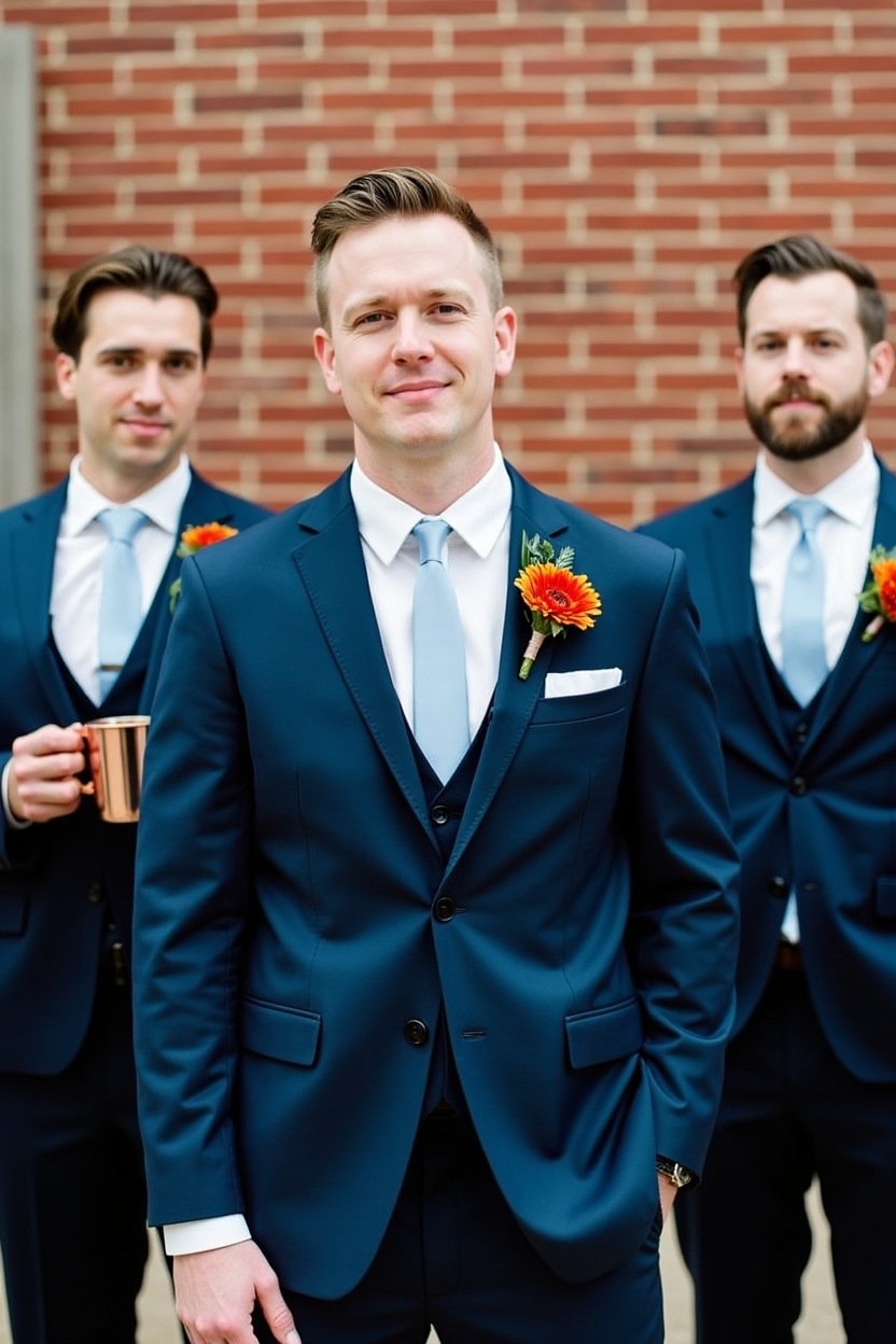
8. Navy Blue, Burnt Orange & Copper: Modern & Bold
This is a power couple of a color palette. The deep, grounding stability of navy blue provides a classic and sophisticated base, while the vibrant, energetic pop of burnt orange adds a distinctly autumnal and modern flair. The addition of copper as the metallic accent, with its warm, industrial-chic vibe, ties the whole look together perfectly.
The Vibe: Confident, contemporary, and stylish. This palette is fantastic for a city wedding, an industrial loft, or a modern barn venue.
How to Bring It to Life:
Bridal Attire: Navy blue is a universally flattering and timeless choice for bridesmaid dresses. The bouquets will pop against this dark backdrop. The groom could wear a sharp navy suit with a burnt orange tie or pocket square.
Florals: This is where the burnt orange shines. Use orange dahlias, terracotta roses, and bronze chrysanthemums. Small touches of a lighter color, like cream or blush, can be added for softness.
Tablescapes: A crisp white or a deep navy linen provides a great starting point. Burnt orange napkins will make a bold statement. Use copper mugs for a signature cocktail (like a Moscow Mule), and copper-toned flatware and charger plates.
Decor: A custom copper arch for the ceremony would be a stunning focal point. Use navy blue signage with copper lettering for a sleek, modern look. For unique decor finds, check out a marketplace like Etsy.
This is a palette for the couple who is chic, modern, and wants their wedding to feel like a stylish, curated event.

9. Forest Green, Tan & Cream: Natural & Serene
Inspired by the quiet beauty of a forest in late autumn, this palette is calming, organic, and incredibly sophisticated. The deep, grounding essence of forest green is softened by the warmth of a neutral tan and the clean brightness of cream. It’s a palette that feels both luxurious and completely at one with nature.
The Vibe: Peaceful, elegant, and nature-inspired. Perfect for a wedding in the mountains, a lakeside ceremony, or in a venue with large windows that bring the outdoors in.
How to Bring It to Life:
Bridal Attire: Forest green bridesmaid dresses in a simple, elegant silhouette are a stunning choice. The groomsmen would look dapper in classic tan suits.
Florals: Focus on greenery. Use a mix of ferns, eucalyptus, and smilax to create lush, forest-like arrangements. Intersperse with cream-colored flowers like roses, lisianthus, and anemones.
Tablescapes: Use a cream-colored linen to keep the space bright. A forest green runner and tan-colored napkins create a beautiful, earthy look. Incorporate natural wood elements, like wood slice chargers or place card holders.
The Wedding Cake: A simple, elegant white cake adorned with fresh greenery and a few cream-colored blooms is the perfect, understated choice for this palette.
This palette is for the couple who finds romance in the quiet moments and in the beauty of the natural world. It creates a serene and intimate atmosphere for a truly heartfelt celebration.

10. Moody Monochromes: Shades of Grey, Black & Deep Charcoal
This palette is the epitome of edgy, high-fashion romance. It moves beyond a simple black and white and explores the rich, dramatic world of monochromatic grey tones. From a light, silvery grey to a deep, intense charcoal, this palette is all about texture, shadow, and sophisticated layering. A touch of black anchors the look, creating a vibe that is both moody and incredibly chic.
The Vibe: Edgy, artistic, and fashion-forward. Ideal for an urban loft, a modern art gallery, or a dramatic, architectural space.
How to Bring It to Life:
Bridal Attire: Embrace the mix-and-match trend by dressing your bridesmaids in different shades of grey, from light silver to deep charcoal. This creates a stunning, dimensional look in photos.
Florals: With such a neutral palette, you have two options: stay monochromatic with white and black anemones, white roses, and dark foliage, or add a single, dramatic pop of a deep, bloody red.
Tablescapes: Layer shades of grey. A charcoal linen, light grey plates, and a medium grey napkin. Use matte black flatware and smoky grey glassware. The key here is an abundance of candlelight to create warmth and play with shadows. For ideas on creating drama with your tables, check out Creating Memorable Wedding Tablescapes For Your Wedding Table Settings with a Unique Twist.
Photography: This palette lends itself to stunning, fine-art style photography. Talk to your photographer about capturing the moody, romantic vibe with dramatic lighting and black and white shots. A great resource for finding photographers is The Knot.
This palette is for the couple with a strong sense of style who wants to create a wedding that feels like a work of art.
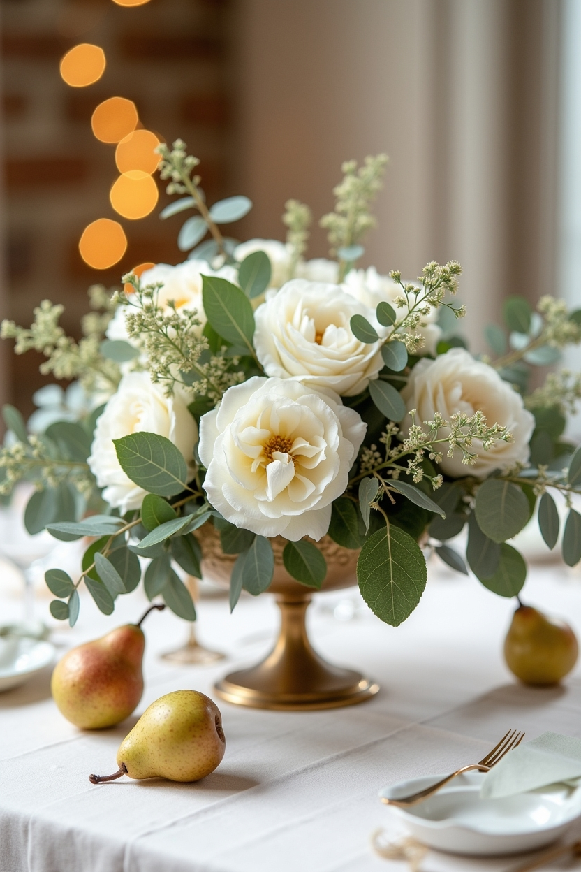
11. Spiced Pear, Gold & Ivory: A Touch of Orchard Elegance
This is a soft, warm, and luminous palette that feels unique and utterly romantic. "Spiced Pear" is a sophisticated, muted green-gold hue, reminiscent of a ripe pear in the autumn sunlight. Paired with a classic, shimmering gold and a soft, creamy ivory, the result is a palette that is both elegant and warmly inviting.
The Vibe: Gentle, luminous, and sophisticated. It’s perfect for a daytime autumn wedding, a vineyard reception, or a celebration at a historic inn.
How to Bring It to Life:
Bridal Attire: Dresses in a soft, pear-green satin or silk for the bridesmaids would be breathtaking. Ivory dresses with gold beading would also be a stunning choice.
Florals: Focus on white and ivory flowers like roses, hydrangeas, and lisianthus. The "Spiced Pear" color comes from the greenery—think silver dollar eucalyptus, dusty miller, and soft green hanging amaranthus.
Tablescapes: Use ivory linens as a base to keep things light and airy. Incorporate the pear hue with colored glassware or a delicate satin table runner. Gold cutlery and gold-rimmed glasses add that essential touch of warmth and sparkle.
Decor Details: Place actual pears, perhaps spray-painted gold, on each place setting as a unique place card holder. Use lots of warm, glowing fairy lights to enhance the luminous feel.
This palette is a subtle, sophisticated nod to the harvest season, perfect for a couple who appreciates quiet elegance and natural beauty.

12. Deep Teal, Marigold & Mahogany: Unexpected Autumn Vibrancy
This palette proves that fall weddings don’t have to be limited to traditional autumn colors. The deep, jewel-toned teal provides a rich and unexpected base, while the vibrant, sunny marigold adds a burst of joyful energy. The addition of a warm, dark mahogany wood tone grounds the palette and keeps it feeling appropriate for the season.
The Vibe: Eclectic, vibrant, and full of personality. This is a great choice for a creative couple having their wedding at a unique venue like a museum, a botanical garden, or a retro-chic hotel.
How to Bring It to Life:
Bridal Attire: Deep teal is a stunning and universally flattering color for bridesmaid dresses. The marigold color can be the star of the bouquets, creating a beautiful contrast.
Florals: Marigolds are a must! Combine them with yellow zinnias, goldenrod, and deep orange dahlias. For a touch of teal, you can incorporate dyed elements or focus on deep green foliage.
Tablescapes: Use rich mahogany farm tables or wood chargers to bring in that grounding element. A deep teal runner with marigold-colored napkins would be a bold and beautiful statement.
Invitations: Don't be afraid to go bold. An invitation with a modern, graphic print in teal and marigold would perfectly capture the fun, eclectic vibe of your celebration. For beautiful custom invitations, look to designers on Minted.
This palette is for the couple who wants their wedding to be a vibrant, joyful celebration of their love, filled with color and life. It's a reminder that love is a grand adventure, a theme also found in many exciting romance novels.
Conclusion: Painting Your Perfect Day
Choosing your wedding color palette is one of the first and most exciting decisions you will make in your planning journey. It is the thread that will tie every element of your day together, from the first glimpse of your invitations to the final dance under the stars. The colors you choose will not only shape the look of your wedding but also the feel of it, creating an atmosphere that is a true reflection of you as a couple.
The fall of 2025 is a season of romantic possibilities. Whether you are drawn to the moody opulence of jewel tones, the gentle grace of new neutrals, or the bold vibrancy of an unexpected combination, there is a palette that will perfectly capture the essence of your love story. Use these ideas as a starting point, a springboard for your own creativity. Mix and match, layer textures, and most importantly, choose the colors that make your heart sing. Your wedding day is a once-in-a-lifetime celebration, a masterpiece of your own making. Let it be a day filled with color, beauty, and boundless love.

Frequently Asked Questions (FAQs)
1. How do I choose the right fall wedding palette for my venue? Consider your venue's existing decor. If it has strong colors (like dark wood, or colored carpets), you might want to choose a palette that complements it. For a "blank slate" venue like a loft or tent, you have more freedom. An outdoor venue naturally lends itself to earthy, organic palettes.
2. How many colors should I have in my wedding palette? A good rule of thumb is to have 2-3 main colors and 1-2 accent colors (often a neutral and a metallic). This keeps the look cohesive without being overwhelming. For example, Burgundy and Dusty Rose (main colors) with Cream (neutral) and Gold (metallic).
3. Should my wedding colors match the season exactly? Not at all! While traditional fall colors are beautiful, don't feel limited by them. Palettes like Deep Teal & Marigold or Dusty Blue & Terracotta show how you can create a stunning autumnal feel with unexpected hues. It’s more about the mood and richness of the colors you choose.
4. How do I inform my guests about the wedding colors? Your invitation suite is the first and best way to introduce your color palette. However, you shouldn't ask your guests to dress in your specific colors unless you are having a themed wedding and state it clearly on the invitation (e.g., "Black-Tie Attire").
5. What if my partner and I can't agree on a color palette? This is a great exercise in compromise! Have each partner create a Pinterest board of images they love. Look for common ground. Maybe you both like deep, rich colors, or perhaps you're both drawn to a more natural aesthetic. Try to find a primary color you both love and then build the palette from there. Communication is key!
6. Where should I use my main colors versus my accent colors? Use your main colors for the big-impact items: bridesmaid dresses, linens, and major floral arrangements. Use your accent colors for the smaller details: napkins, stationery details, glassware, and metallic elements like cutlery and candlesticks.
7. Can I mix metals in my color palette? Absolutely! Mixing metals is a very modern and stylish approach. For example, in a warm palette like Terracotta & Burnt Orange, you could use both gold and copper accents. The key is to be intentional and spread them throughout the decor.
8. How do I incorporate my colors without it looking too "matchy-matchy"? Use different shades and tones of your chosen colors. For example, instead of just "green," use sage, olive, and forest green. Also, play with textures—velvet, silk, cheesecloth, and wood in the same color family will look rich and layered, not flat.
9. What's the best way to visualize my color palette? Create a physical or digital mood board. Gather fabric swatches, paint chips, ribbon, and images of flowers and decor that you love. Tools like Canva or Pinterest are great for creating digital mood boards.
10. I love a bold color but I'm afraid to commit. Any advice? Use your boldest color as an accent. If you love marigold but don't want yellow dresses, use it in the bouquets, for the napkins, or in a signature cocktail. This allows you to enjoy the vibrant pop of color without it dominating your entire wedding aesthetic.


.jpg)


.jpg)

Comments